View Poll Results: Which logo do you think is most effective?

Voters
36. You may not vote on this poll
  • Logo 1

    5 13.89%
  • Logo 2

    5 13.89%
  • Logo 3

    20 55.56%
  • logo 4

    3 8.33%
  • Logo 5

    1 2.78%
  • Logo 6

    4 11.11%
Multiple Choice Poll.
Results 1 to 20 of 34

Help me pick my logo

| General - Let's talk business

Hybrid View

  1. #1
    Electrowaste started this thread.
    Electrowaste's Avatar
    SMF Badges of Honor

    Member since
    Jan 2013
    Location
    NE Alabama
    Posts
    279
    Thanks
    622
    Thanked 313 Times in 130 Posts
    Thank you sir!


  2. #2
    ryanw's Avatar
    SMF Badges of Honor


    Member since
    Oct 2012
    Location
    TX
    Posts
    1,316
    Thanks
    530
    Thanked 1,289 Times in 647 Posts
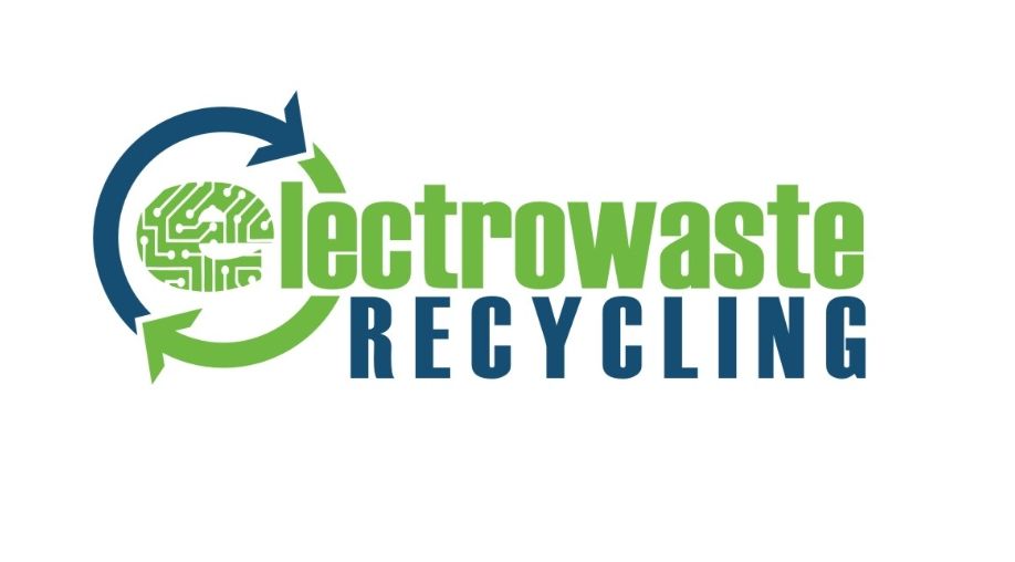
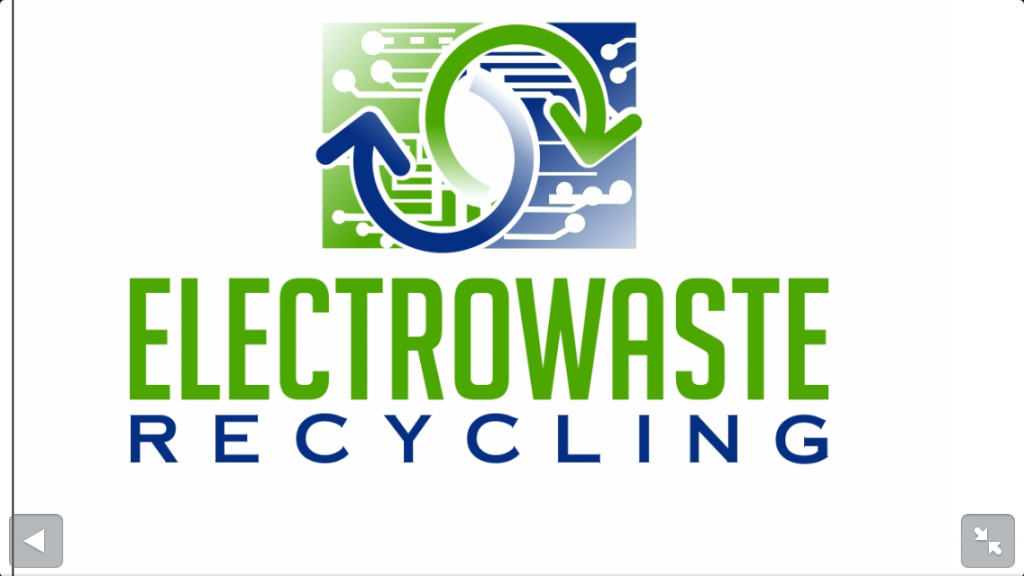
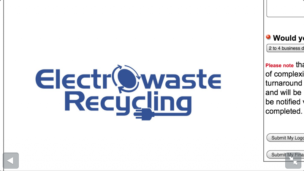
    I voted for #1 and here's why:

    1. I like simpler graphics, that's just my preference.
    2. With simpler graphics (2 colors, less detail, etc) it is much easier to transfer to different media. It may look great on a computer, but how does it look on a window, flyers, t-shirts, etc? How does it look in black and white? Although I'm not a graphic designer, I never liked messing around with gradients on graphics. It never came out the way I liked it when printed.
    3. Two colored graphic would give you a basic color theme for your business, and an extra option that just one color.


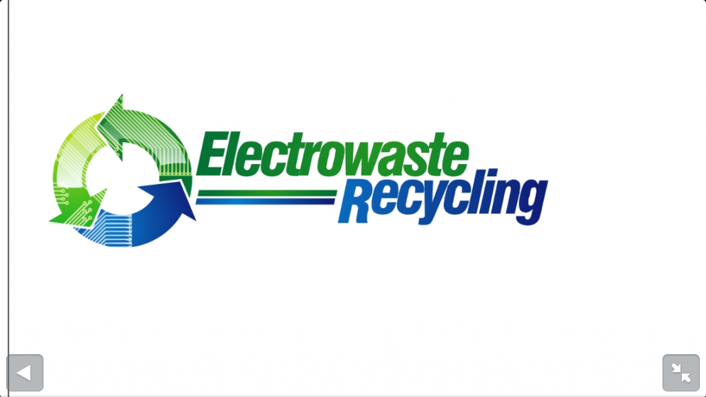
    I also liked #6, but maybe change the arrows and the "o" to the green color.

  3. The Following User Says Thank You to ryanw for This Post:


  4. #3
    Electrowaste started this thread.
    Electrowaste's Avatar
    SMF Badges of Honor

    Member since
    Jan 2013
    Location
    NE Alabama
    Posts
    279
    Thanks
    622
    Thanked 313 Times in 130 Posts
    Thanks for your help guys! What we are considering now is a hybrid. We'd like to mix the words & stripes from #3 and the triangle logo from #4. We agree that...

    Quote Originally Posted by ryanw View Post
    1. I like simpler graphics, that's just my preference.
    2. With simpler graphics (2 colors, less detail, etc) it is much easier to transfer to different media. It may look great on a computer, but how does it look on a window, flyers, t-shirts, etc? How does it look in black and white? Although I'm not a graphic designer, I never liked messing around with gradients on graphics. It never came out the way I liked it when printed.
    So I think were going to have the ends of the triangle design fixed and all colors be solid.

Thread Information

Users Browsing this Thread

There are currently 1 users browsing this thread. (0 members and 1 guests)

 
Browse the Most Recent Threads
On SMF In THIS CATEGORY.


OR

Bookmarks

Posting Permissions

  • You may not post new threads
  • You may not post replies
  • You may not post attachments
  • You may not edit your posts
  •  

The Scrap Metal Forum

    The Scrap Metal Forum is the #1 scrap metal recycling community in the world. Here we talk about the scrap metal business, making money, where we connect with other scrappers, scrap yards and more.

SMF on Facebook and Twitter

Twitter Facebook